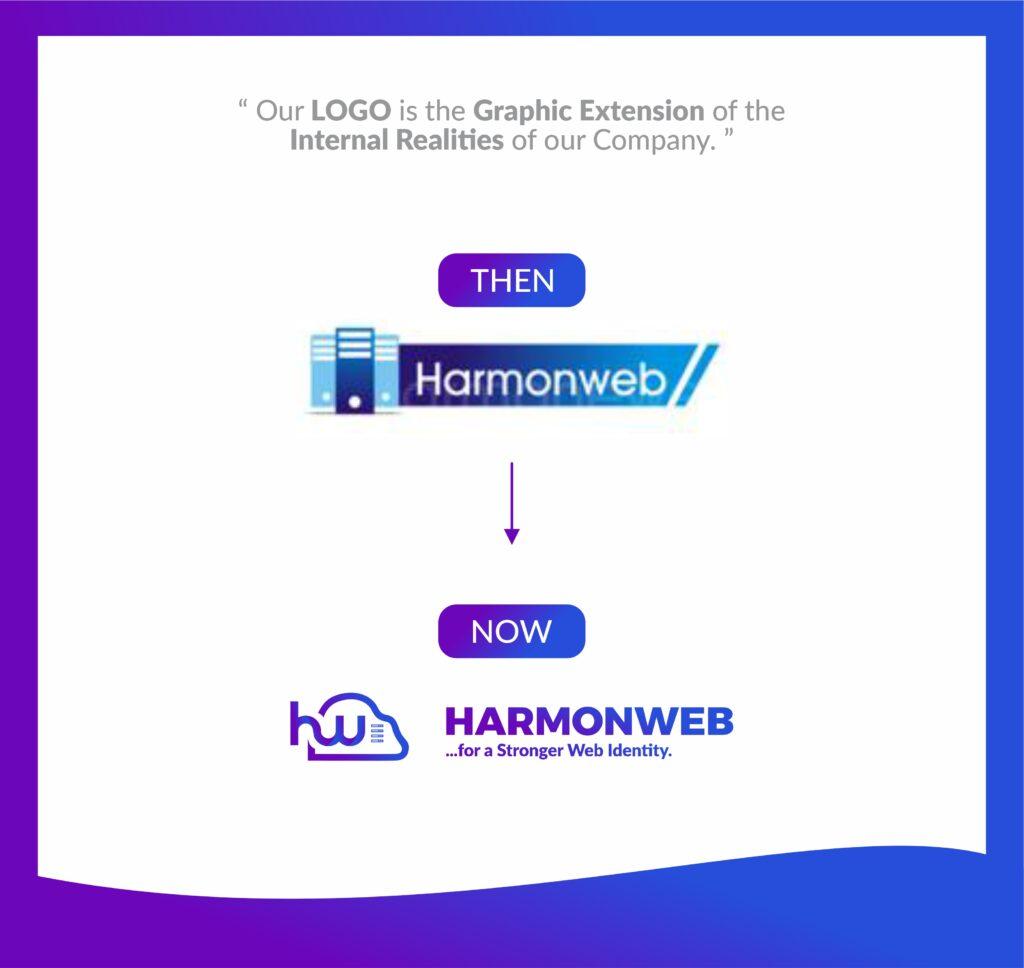
We are proud to announce the launch of the new company logo as part of the ongoing evolution of our company’s brand.
Our business has grown and evolved, and we felt it was time for a change. We have refreshed our logo to reflect who we are today and symbolize our future.
After careful consideration, we chose a new logo that reflects a more modern look and captures our mission to deliver excellent quality, performance, and service support across the products we provide.

Where ‘HW’ stands for “Harmon Web Hosting” as a whole, the design swaps the complicated-looking structure with a gradient of colors and a more minimalist look—taking this approach of re-branding brings the design more in line with the aesthetics and portrays flexibility. The use of the color ‘purple’ at the start to the ‘blue’ at the end indicates the transformation we are focusing on. This transformation implies everywhere from our internal strategy to end-users use of our product, where they see the products they purchased to give them a more reliable and satisfying result.
With a very strategic approach, we are also glad to introduce our business motto, “For a Stronger web identity,” to create a clear picture of our vision and mission and identify the core focus of our business in web hosting. Highlight Innovation focused mindset of Harmon Web hosting company.
We aim to present ourselves better and cater to you with better services in times to come.
The task in the upcoming months will be to update all our collaterals, uniforms, machines, business cards, etc., with the new logo. We realize that changing a logo is a process that can involve many steps and take some time, so we will finalize it gradually.
If you have used the Harmonweb logo in any of your marketing materials, please assist us in updating them. We appreciate your kind support. If you have any questions, please don’t hesitate to contact us.


